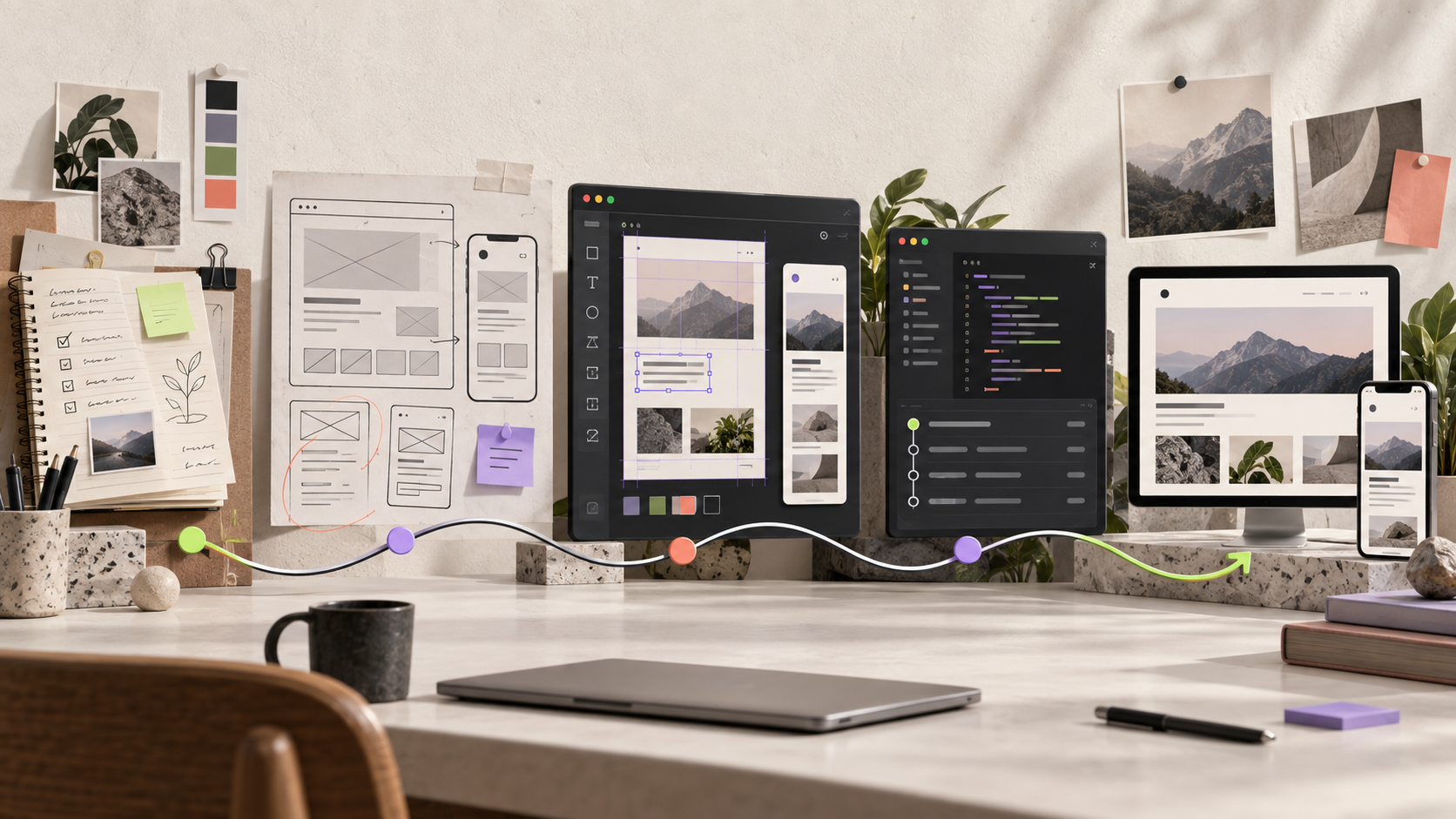
For a long time, my portfolio was the project I was always “almost done” with.
I’d fix the homepage, then realize a project page was too hard to scan. I’d clean up the project page, then notice the mobile layout didn’t hold together. Every improvement exposed another problem.
The current website is roughly the fourth real version. Before it, there was a Notion workspace, a full design in Figma, and a live site built with Framer. Then I started rebuilding it with Codex while learning GitHub as I went.
That wasn’t the plan. There wasn’t a plan.
Somewhere to put my work
My first portfolio lived in Notion because I needed a link I could send to people. That was the whole brief.
I collected my projects, wrote down the thinking behind them, added screenshots, and published the pages. No code. No hosting problems. No weeks lost to choosing an animation curve. It did the job.
But the more work I added, the harder it became to read. A hiring manager had to open several pages and piece together what I’d done, why I’d done it, and what changed because of it.
I could find everything because I’d built the structure. A first-time visitor couldn’t.
Notion wasn’t the problem. It’s still a sensible way to publish a first portfolio. I’d simply reached the point where the container was shaping the story more than I wanted it to.
The design was ready before the website was
So I opened Figma and designed the site I actually wanted.
I chose what people would see first, where each project needed context, and when an image could do more work than a paragraph. I could control the pace instead of fitting every case study into the same page template.
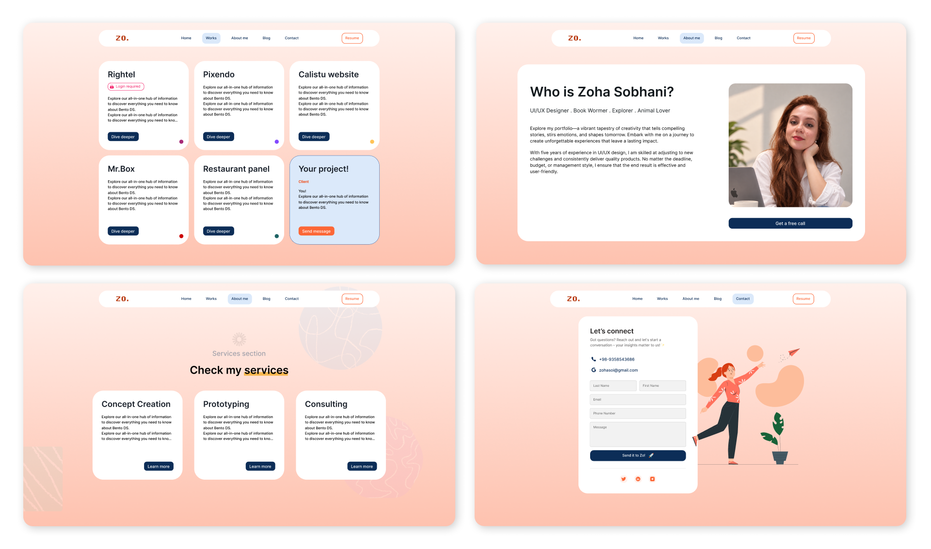
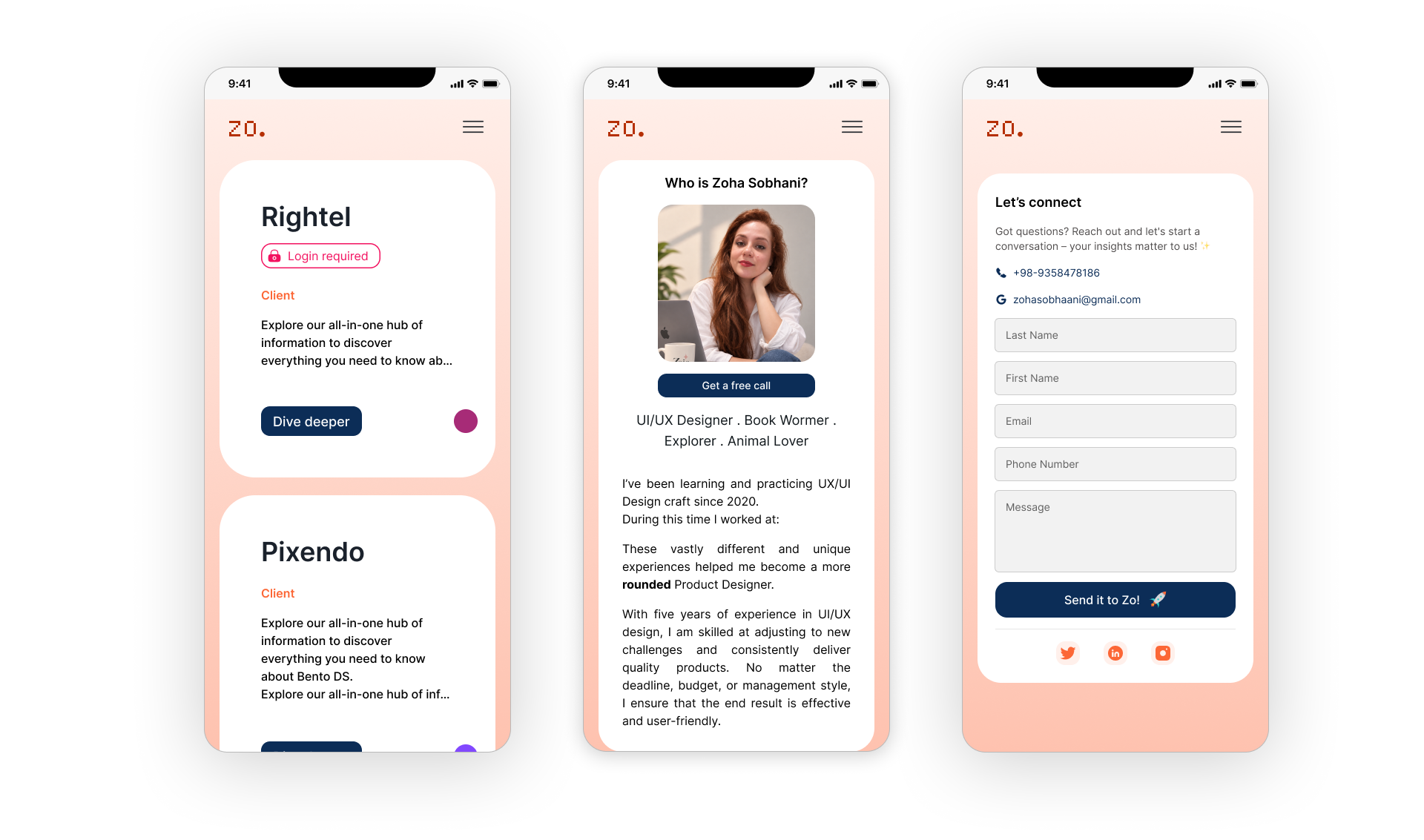
Then I had to build it.
A tidy Figma frame can hide a lot of trouble. Real text wraps. Images arrive in different ratios. A layout that feels balanced at 1440 pixels can fall apart on a phone. And the interaction that took ten minutes to prototype may take hours to make reliable in a browser.
I knew what I wanted to see, but I didn’t yet know how to build all of it. Progress slowed down.
Getting something out into the world
I spent close to a month learning Framer and rebuilding the site inside it. Some ideas transferred cleanly. Others had to change once I saw how they behaved outside Figma.
Still, the site was finally becoming real. I could click through it, test the pages, and send someone a working link instead of another prototype.
Publishing that version mattered. It also made the weak spots impossible to ignore.
Some interactions felt too generic. A few sections worked, but didn’t quite sound or move like me. Framer had helped me cross the gap between a design and a live website, yet I still wanted more control over the result.
Working with Codex
When I moved the portfolio to GitHub, I treated it as a real implementation project rather than another visual prototype. The site is built as a static Jekyll project with HTML, CSS, and JavaScript, then published through GitHub Pages.
I defined the information architecture, visual direction, interaction behavior, and content. I used Codex to help translate those decisions into the codebase, inspect existing files, trace layout problems, and make targeted changes without rebuilding every page by hand.
The work happened feature by feature. I refined the navigation, rebuilt the homepage hierarchy, structured the case-study pages, set responsive breakpoints, tuned motion timing, optimized media, and checked how each change behaved across desktop and mobile. Every update went through the same loop: edit the code, review it in the browser, identify what was wrong, and revise it.
GitHub became the source of truth for the website. I could review diffs, track changes across files, keep assets and content in one place, and publish from the same repository I was testing locally. That made the gap between design and production much smaller.
Working this way also gave me a practical understanding of the codebase. I can follow how pages are assembled, find the CSS behind a layout issue, manage media files, and judge whether a change is ready to publish. My role is still rooted in product design, but I can now carry decisions much further into implementation.
Codex supported the coding and debugging work. The product direction, UI decisions, content, iteration priorities, and final quality checks remained mine.
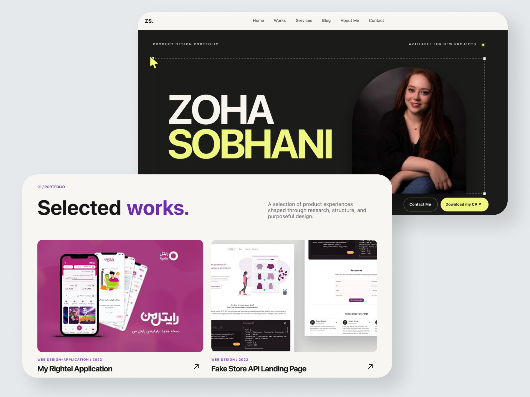
This image shows the final homepage and selected-work section, including the updated visual hierarchy, navigation, and case-study entry points.
You can also visit the live portfolio.