Start with three button styles, three sizes, five interaction states, and three icon arrangements. Build a separate variant for every combination and you’ve already got 135 versions.
Each new option adds combinations to review when the component changes.
That number is from a teaching example, not a count of Rightel’s library. It shows how quickly a small list of choices can turn into a large maintenance task. The team needs to know which of those combinations are useful and how to maintain them.
I want a designer to find the right button, change the content, and use it without repairing the layout. Variant count alone doesn’t tell me whether that’s possible.
Start with the buttons people actually need
In Rightel’s older library, a Large button had a 4-pixel corner radius while Medium used 16 pixels. Some interaction states were also missing. The work involved making geometry and behavior more consistent, alongside supporting the styles and configurations the product needed.
We’d started with Material Design under time and implementation constraints. Studying its component structure helped me understand how our additions should fit. It didn’t remove the need to review our own screens.
Before deciding on properties, I’d collect buttons from a few active flows. Look at a form’s submit action, a secondary action beside it, and a button with an icon. Note why their appearance or layout differs.
“The label says Save instead of Continue” is a content change. “This action needs less visual emphasis” is a design choice. Treating both as reasons to duplicate the component creates work without making the choices clearer.
Choose the right kind of property
A variant is one of Figma’s component property types. The useful question is which kind of property fits the change. For this button example, I’d start with these options:
| What needs to change? | Starting choice |
|---|---|
| Label wording | Text property |
| Whether an optional icon is visible | Boolean property |
| Which icon appears | Instance swap property |
| A predefined style, size, or visual state | Variant property |
These property types are described in Figma’s component properties guide. The table is a starting point for this example, not a complete inventory of Figma’s features.
I’d expose a label field so someone can enter “Save changes” without opening the component’s layers. An icon swap should let them choose the appropriate icon while preserving the button’s layout. Size should represent an agreed set of dimensions, not just a word added to a copy’s name.
But hiding an icon only solves the visibility problem. If removing it requires different padding, check whether the layout can handle that change. A Boolean property won’t define a new spacing rule for you. A layout variant may be justified when the actual structure needs to differ.
Make the structure work before multiplying it
I’d build and inspect one default button first: the outer frame, label, optional icon, and the spacing between them. Apply the color, spacing, and text decisions from the previous post where they belong.
Then try real content. Replace “Save” with “Save changes and continue.” Hide the icon. Swap it for one with a different visual shape. Place the button in the narrowest layout the product supports.
Decide whether the label should wrap, whether the button should grow with its content, and when it should fill its container. Those rules need a product context. Adding a Large variant won’t fix an undefined width rule.
For Persian and English, check the actual label and icon order in both directions. “Leading icon” means before the label in reading order; it doesn’t always mean left. The Figma structure and implementation still need to support that arrangement. Renaming a property won’t make it happen.
Once the base layout behaves properly, make the variations the product needs. Otherwise, every extra variant inherits the same unresolved layout problem.
Decide which combinations belong in the product
Suppose this smaller teaching example needs Filled and Outlined buttons, each in Small and Medium. It supports either no icon or one leading icon. There is no current need for a trailing icon or an icon-only button.
I’d build those supported choices and document the boundary. If an icon-only action becomes necessary, I’d consider it separately: it needs its own sizing and a clear accessible name even though no label is visible.
Two independent switches for leading and trailing icons would also allow both to appear at once. If that combination isn’t supported, the configuration is offering a choice the team hasn’t designed. An explicit layout choice such as None, Leading, or Trailing may fit better when those arrangements are needed.
Documentation helps explain the rules, but it doesn’t enforce them. Check what the Figma properties actually allow, then agree on the valid combinations with the developer. The implementation should express those constraints too.
I’d add an option when a screen needs it and the existing settings don’t cover the requirement. That gives us something specific to review before expanding the component.
Keep necessary states, even when they add variants
Reducing duplicate content doesn’t mean removing focus, pressed, or disabled examples. Those states answer different interaction questions.
A Figma set might present them as separate visual examples. In the implemented product, focus and hover can occur together. A single list of state names doesn’t describe every behavior or which treatment takes priority.
Write down how overlapping states should work. If the button shows progress after submission, also decide what happens to its label and width, whether another press is allowed, and how completion is communicated. A spinner drawn inside a button doesn’t settle those decisions.
Likewise, if light and dark versions share the same structure, color variables with modes may handle the theme change without duplicating every visual variant. That still leaves both themes to inspect. Figma’s variables guide explains how one variable can provide values for different modes.
Use a comparison sheet to review, not to judge the count
The evolved Rightel buttons covered several styles, states, and icon arrangements. Seeing them together helped make those differences visible.
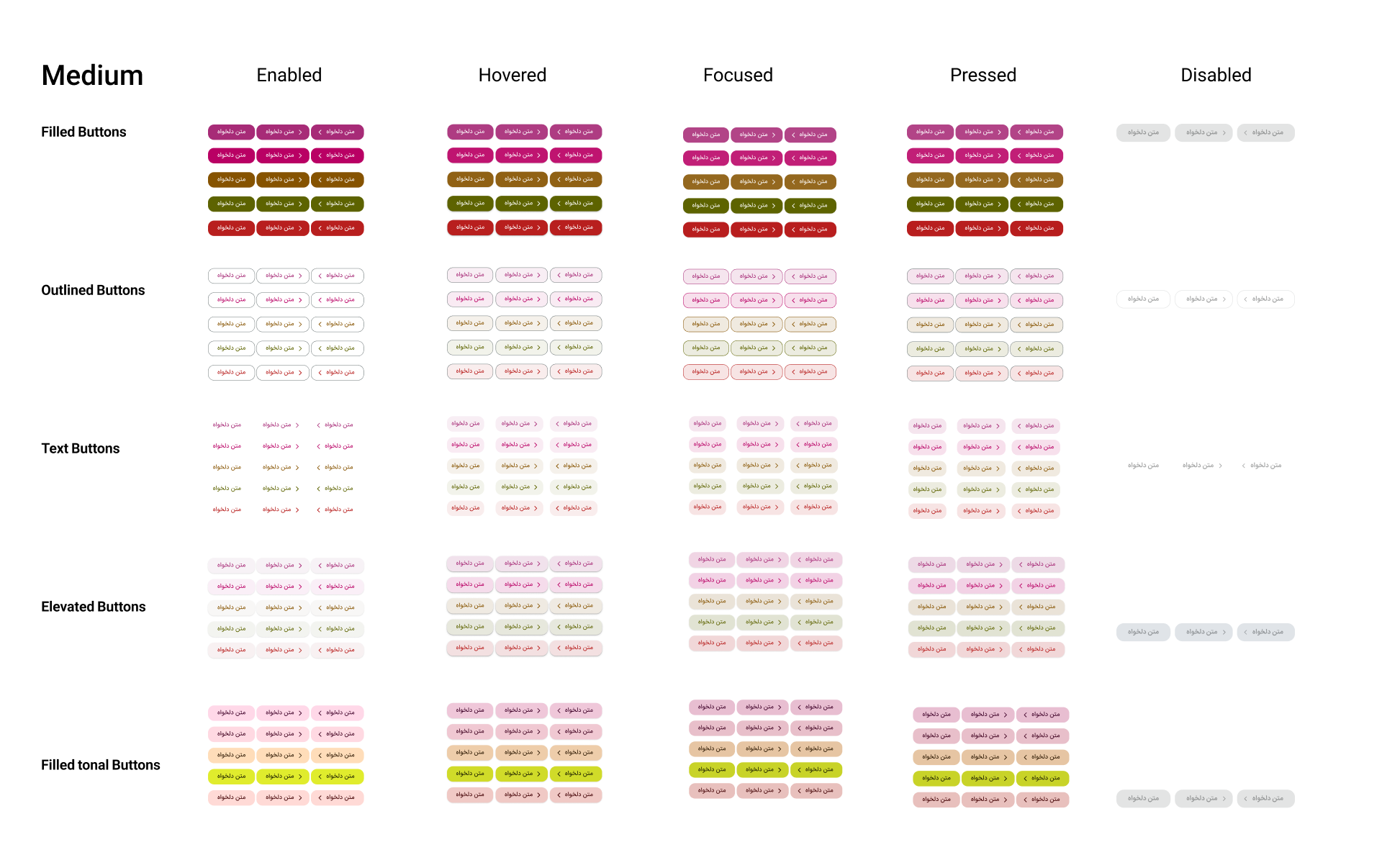
The Rightel comparison includes Filled, Outlined, Text, Elevated, and Filled tonal buttons. It illustrates a broader product scope than the smaller teaching example above.
A large comparison sheet isn’t automatically a badly structured component. Nor does a short property panel prove the component is easy to use. Check why each choice is there and what happens when someone uses it.
Try it without explaining it
Give another designer a small task: create a secondary action, change its label, add an icon, and place it next to the primary action in a narrow form. Watch where they pause or start editing internal layers.
Then change the size and state. Check whether the label and chosen icon survive, whether the spacing still works, and whether any unsupported combination is easy to create by accident. You can do this with a few representative instances before applying the component across the library.
I’d review the same examples with a developer. For a Disabled setting, agree on the expected interaction as well as its appearance. A button that fills its parent needs an agreed width behavior in code. Resolve those details before other screens start depending on them.
In the next post, A Component Isn’t Finished at Default, I’ll focus on what happens during use: focus, errors, loading, empty content, and the behavior a polished default state can hide.