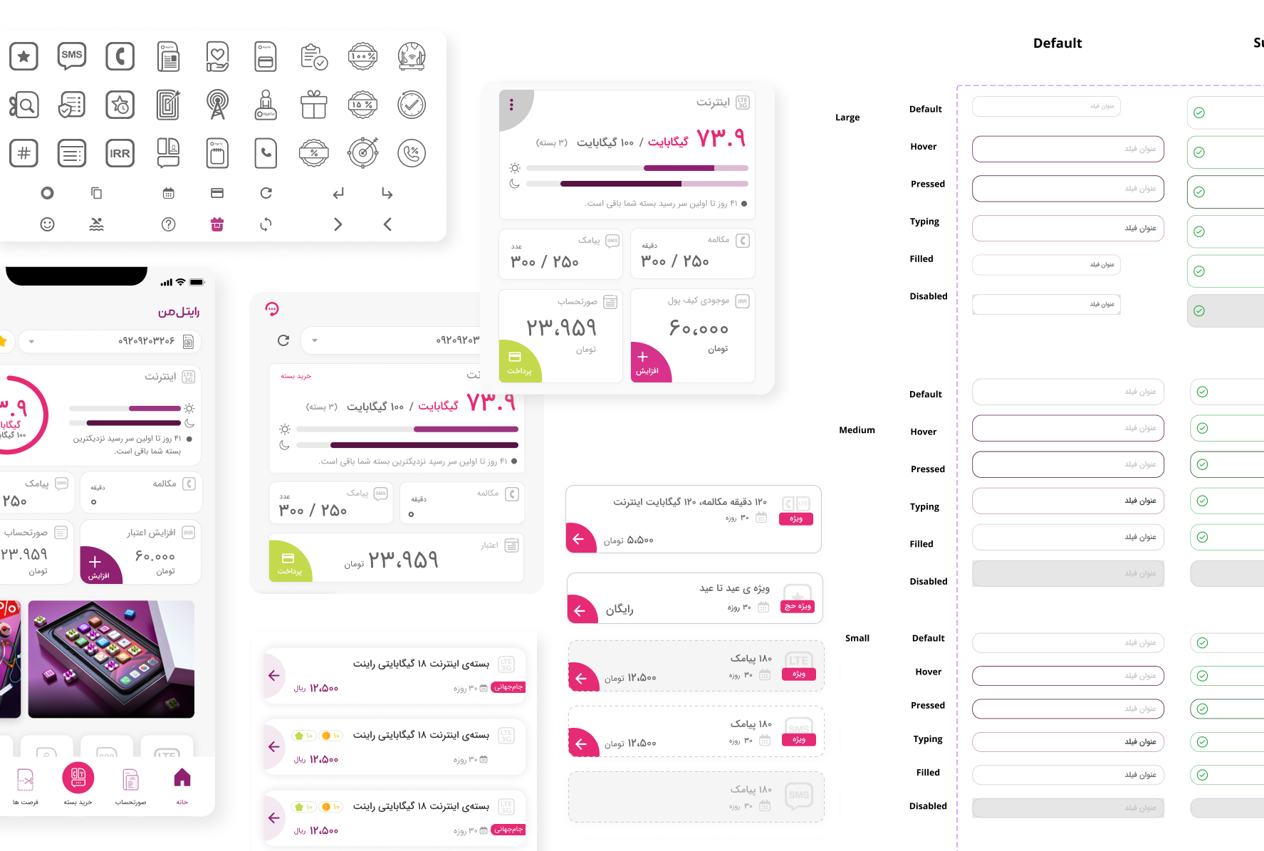
A component library can look orderly while leaving designers with the same unanswered questions on every screen. Renaming its layers won’t tell you why a field has been detached, or whether two similar buttons actually serve different needs.
You have to look at where those components are used.
In my work on Rightel’s design system, I compared the older library with patterns already used across the product. I grouped components by purpose and examined their structure, sizes, settings, and states. The useful findings came from putting the library and its screen context beside each other.
We’d started with Material Design because time and implementation constraints made an existing foundation the sensible choice. We also needed custom components. Understanding Material’s structure helped me judge how those additions should fit; reviewing our own screens showed me where the library still left decisions open.
Start with a flow you can finish reviewing
An audit gets unwieldy when its first task is “collect every screen.” I’d start with one active flow and the component families it relies on. A form is a useful candidate: fields, buttons, labels, and feedback all have to work together.
Bring the library components into a Figma page beside their instances from that flow. Keep a link to each source screen and note whether the example comes from a design file or the live product. A design file alone can’t tell you what shipped.
For each example, record its purpose, the component it uses, and any local changes. Include the states the flow needs, even when they aren’t drawn yet. An error state marked “not checked” is more honest than an empty cell that someone could mistake for “not needed.”
I’d keep archived screens separate. They can explain how a pattern developed, but they shouldn’t carry the same weight as a screen people still use.
Group by the decision the user is making
Names make a poor starting point when naming is part of the problem. Two components can share a name and behave differently. Two others can have different names and do the same job.
Group examples by purpose first: entering information, choosing an option, starting an action, or showing feedback. Then compare the details within each family.
In the older Rightel library, two text-field families both offered a “Large” size. One was 48 pixels tall; the other was 60 — roughly a quarter taller. The name didn’t explain the difference, and there wasn’t a distinct functional need behind it in the examples I reviewed.
That was a finding worth recording. “These fields look different” wasn’t specific enough. “Equivalent fields use the same size label for different heights” gave me a decision to investigate.
Read the layers, then check the states
The outside of a component only tells part of the story. Open it in Figma and look at how the label, content, icons, supporting text, and container fit together. Check which choices are exposed as properties and which require editing the instance.
Because we were extending Material, I spent time learning its component structure and the relationship between layers and states. That gave me a basis for reviewing our custom additions beyond whether they looked similar.
An override isn’t automatically a mistake. It may reveal a setting the shared component should support. A detached instance is a lead to follow: what couldn’t the designer do with the original?
Then inspect the states that matter for that control. For a button, I’d check focus, hover where relevant, pressed, and disabled behavior. For a field, I’d also inspect entered content, validation feedback, and what happens when supporting text wraps. Don’t mark a whole family “complete” because its default state looks finished.
The old Rightel button family exposed another gap: the Large size used a 4-pixel corner radius and Medium used 16. Its interaction states also weren’t fully covered. Geometry and behavior needed separate entries in the audit; changing the corners wouldn’t answer the missing state questions.
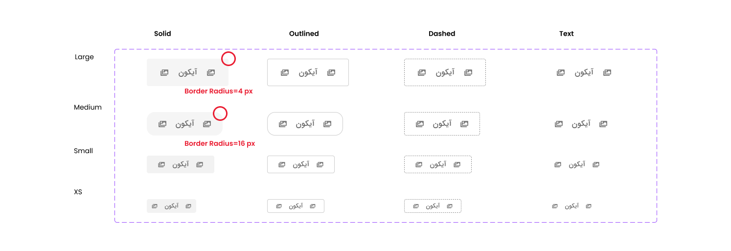
These findings concern the Rightel library I reviewed, rather than Material’s original components.
Turn observations into decisions
A wall of screenshots is useful evidence. I still want a short record that tells me what to do with it.
Here’s a compact example based on the findings above. The actions are proposed next steps, not a claim that this was our original tracking sheet. In your own audit, attach a source link to each row.
| Component and use | Observed difference | State coverage | Proposed next step |
|---|---|---|---|
| Text fields for equivalent input tasks | Both called Large; heights of 48 and 60 px | Check separately; the size finding doesn’t establish a state gap | Confirm the contexts, then define one size rule or name a justified distinction |
| Buttons for product actions | Large uses a 4 px corner radius; Medium uses 16 px | Interaction coverage is incomplete | Review the shape rule and record the missing states before rebuilding |
For each finding, choose a direction: keep it, clarify it, merge it, extend it, or investigate further. That last option matters. If you haven’t checked why a difference exists, you aren’t ready to remove it.
A denser control may belong in a space-constrained view. An unfamiliar shape might reflect an implementation constraint. Ask the people who designed and built that flow before turning an assumption into a system-wide rule.
Fix what blocks real work first
Under delivery pressure, a long list needs an order. I look at three things: how often the component is used, what the gap prevents someone from doing, and how much work a change would create in existing screens and code.
A missing focus state on a common control deserves attention ahead of a small visual difference in an archived screen. A recurring need that forces designers to detach instances is another strong candidate. Frequency matters, but a rare control can still be critical to completing a task.
Review the shortlist with a developer. Agree on what should change, who will take it forward, and how to check it in a real flow. A library fix isn’t finished just because the main component looks correct; its existing instances and implementation need attention too.
I’d stop the first audit when I can explain the highest-priority gaps and name the next decisions. You don’t need to settle every corner of the library before improving one family. Keep the unresolved questions visible and return to them as the product gives you more evidence.
In the next post, From Color Values to Design Decisions, I’ll look at the rules underneath those components: how to turn recurring choices about color, spacing, and type into foundations and tokens that describe their purpose.