Two text fields in the older Rightel library were both called “Large.” One was 48 pixels tall. The other was 60.
Same name. Different rules.
There wasn’t a clear difference in their purpose to explain the extra height. A designer could pick either one for an equivalent task and end up with a different form layout. Both choices came from the library.
That detail captures the problem I worked on while helping evolve Rightel’s design system. Components already existed. What needed work was the logic connecting them.
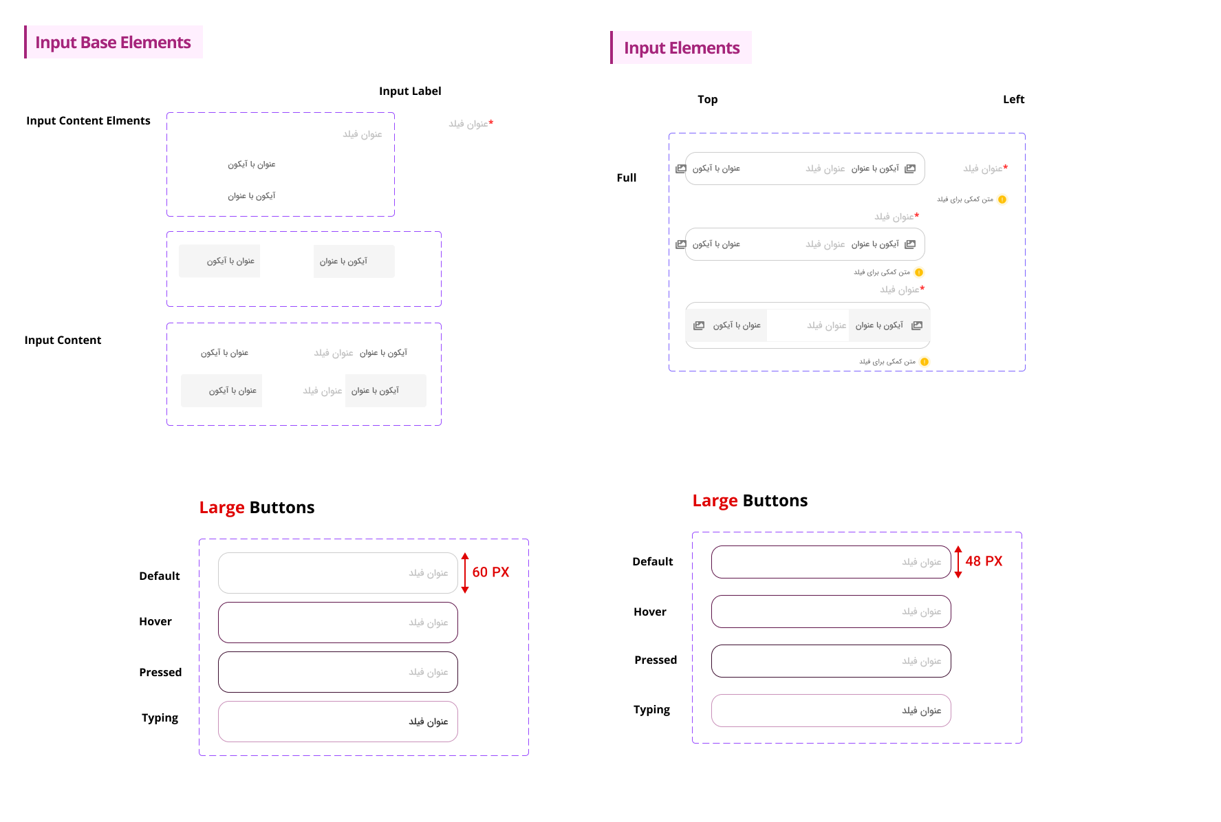
Both sizes were available under the same label. The library didn’t explain when to choose one over the other.
Why we started with Material Design
Time and implementation constraints shaped the work. Our team needed an existing foundation, so we chose Material Design as the basis for the system.
But our product needed components beyond what we could use directly. We built those additions around Material’s rules, which meant spending considerable time studying how its components were structured, how their layers fit together, and how that structure supported different states.
That learning was part of the work. Before extending a component, I needed to understand the logic I was extending. Matching its appearance wasn’t enough to make a new component fit the system.
Choosing Material gave us a starting point. It still left us responsible for how we adapted it and how we documented the components we added. The inconsistencies described here came from the Rightel library I reviewed; they weren’t findings about Material’s own library.
When the library leaves a decision unanswered
The height difference was easy to spot. Other gaps took a closer look: similar controls under different names, inconsistent corner radii, configurations that weren’t clearly exposed, and component families with incomplete interaction states.
Each gap left someone with a decision to make while designing a screen.
Take a missing state. If a form needs a particular error treatment and the component doesn’t support it, the designer still has to finish the form. A local edit solves the immediate problem. But unless that decision comes back into the library, the next designer has to solve it again.
That’s how a library can grow while the interface keeps drifting. Reuse helps when the thing being reused carries clear decisions with it.
What I expect a design system to do
A useful component library gives me a control I can place on a screen. A design system also helps me decide whether it belongs there, how to configure it, and what should happen when someone interacts with it.
For a text field, that means more than choosing a height and a border color. I need to understand the label, supporting text, optional icons, and feedback. I also need to know which decisions are fixed and which can change with the context.
The same questions reach into implementation. A focus state drawn in Figma needs a corresponding behavior in the product. A name should point designers and developers toward the same thing. When a new need appears, there should be a way to review it without quietly creating another competing version.
I think that’s where the real work sits: making recurring decisions clear enough that another person can use them without needing the library’s author beside them.
Consistency needs a reason
The two Large fields didn’t prove that every input should have the same height. Different contexts can justify different dimensions. A compact control and a roomier one may both belong in a system.
But that distinction needs a purpose and a name people can understand.
In this case, one field was roughly a quarter taller than the other, yet both presented themselves as the same choice. I couldn’t treat that difference as a useful variant without first finding the need it served.
My working rule became simple: keep a difference when it supports a real use case, and make that use case explicit. When it doesn’t, investigate whether the difference is accidental before preserving it in the next version.
That matters because standardizing everything too quickly can remove something a product actually needs. An audit should help you understand the differences before you decide which ones to keep.
Making choices visible in Figma
Learning Material’s component structure informed how I worked on the evolved library: clearer anatomy, properties, variants, states, and usage guidance. For text fields, that meant organizing filled and outlined styles, labels, input values, icons, and state behavior into a more predictable structure.
For the components our product needed us to add, I had to consider how their structure would fit the same rules. A component could solve a specific screen’s problem and still need more work before it belonged in the shared library.
The point was to make those choices available where someone was working. If a component supports a leading icon, the configuration should say so. If two styles serve different purposes, the guidance should explain the choice.
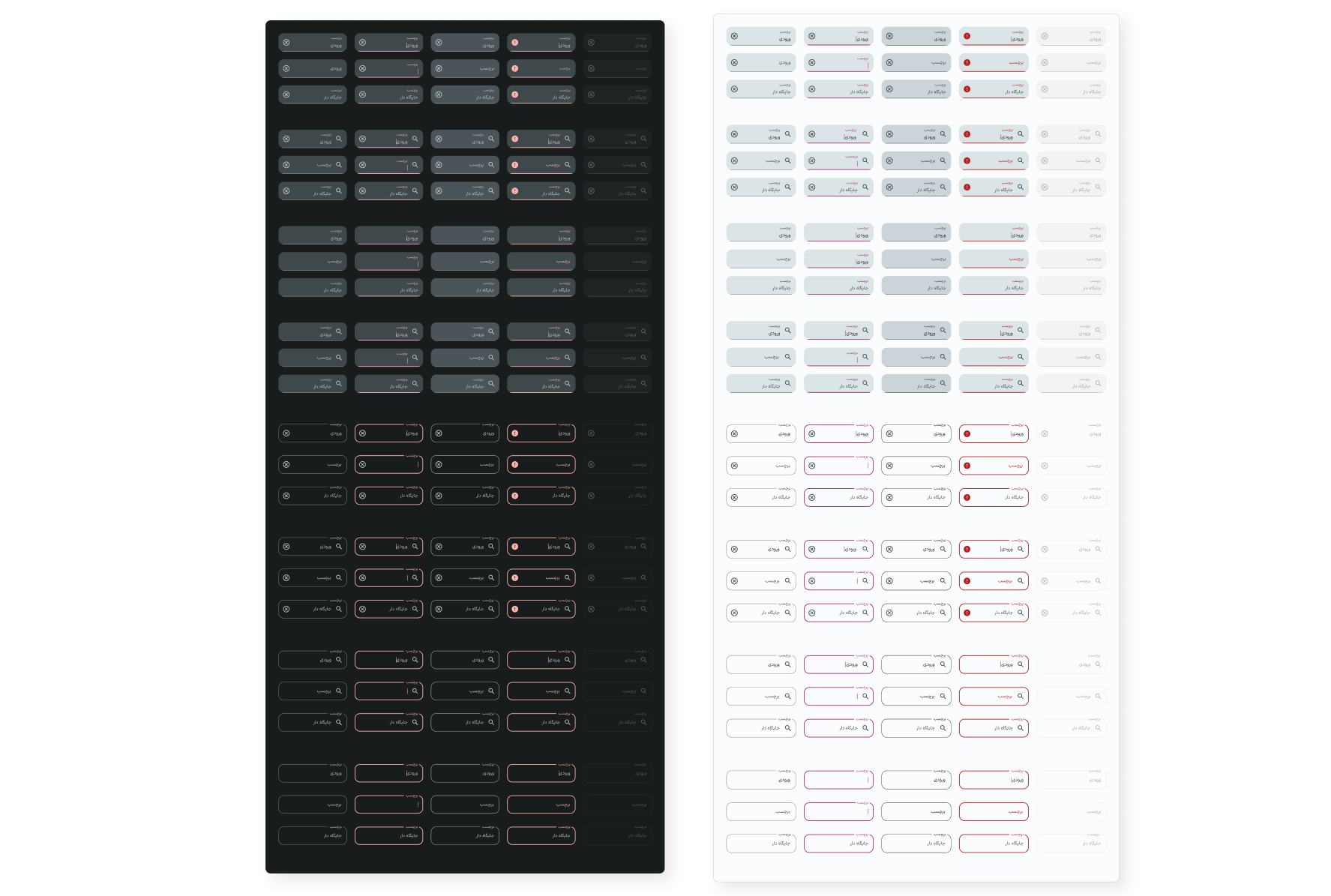
The revised family brings styles, states, themes, and content options into a shared structure.
I can show those changes in the Figma files. I’d need separate evidence to say how much time they saved or how consistently teams adopted them. A more complete library gives you something to test in real work; it doesn’t settle those questions by itself.
Try one component before judging the whole library
Pick a component that appears in several active screens. Compare the instances with the library version and ask:
- Can I tell which version to use without asking its author?
- Do the differences reflect distinct needs, or just separate design decisions?
- If the library builds on an existing system, do its custom additions follow that system’s rules?
- Can I represent the states and content the screen requires using the component’s existing properties?
- If something is missing, is it clear how to request a change?
Write down where the answers become unclear. Keep the component, its screen context, and the unanswered question together. That gives you a specific problem to investigate before you start rearranging the library.
In the next post, Before You Build, Audit What You Already Have, I’ll work through that audit: collecting examples from screens and libraries, grouping them by purpose, and deciding which gaps to address first.